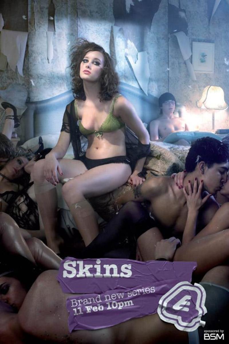
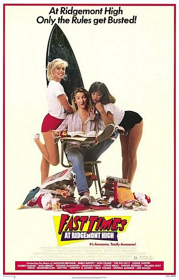
- The font being too simple- we felt it was boring and didn't accurately convey the light hearted tone of the film.
- The lack of a certificate or date for the film, making it look less realistic.
- The arrangement of the text on the bottom- we felt it didn't look professional and would be better central.
So, with these things in mind, we created this draft of the poster (still on the simple Paint tool, so again, the picture is not high quality).

We feel that this poster conveys the comedic tone of the film more accurately, and with the inclusion of the certificate gives a greater indication of who the film is aimed at. The font is far more suited to the genre- it is bouncy and youthful looking, and shows immediately that the subject matter of the film is not serious.
In order to get audience feedback regarding this draft of the poster, I have created a discussion board on our group's Facebook page to ask our peers their opinions on the poster.
 As people reply and give their views, I will print screen them and add them to the blog.


 Above all else, we wanted to both


