What are the main colors used in the poster? What do they connote?
What symbols are used in the poster? Do you need audience foreknowledge to decode the symbols?
What are the main figures/objects/background of the poster? Are they represented photographically, graphically, or illustratively?
Are the messages in the poster primarily visual, verbal, or both?
Who do you think is the intended audience for the poster?"
- http://www.mediaknowall.com/gcse/Blockbuster/posteranalysis.html
As part of our project, we are required not only to make a film, but a poster and a web page as well. In this post, I am looking at the conventions of a movie poster and the ways in which they are used to attract an audience.
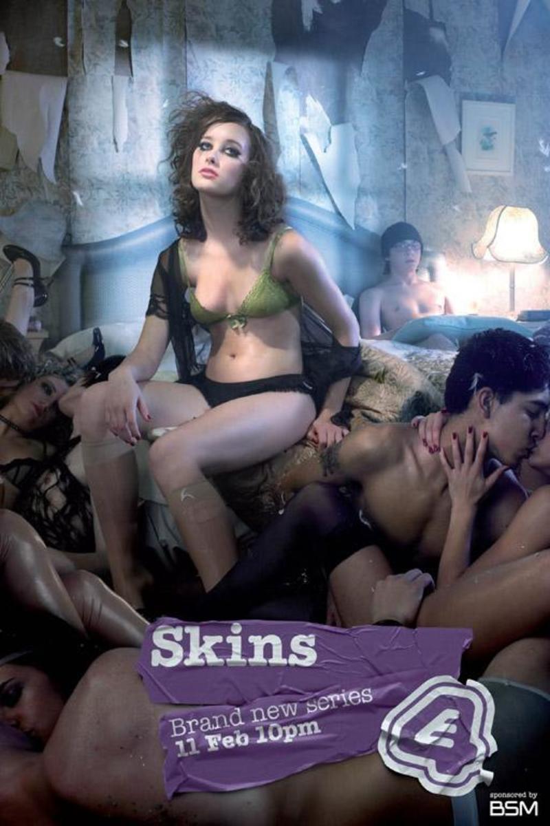
I am going to analyse this poster for Skins. Although it is a TV series, not a film, this poster conveys a kind of darkness that would be ideal for our film. Having a prior knowledge of the series (this poster advertises the second season) I am aware that the girl in the picture has also been embroiled in a love triangle between the boy in the bed and his best friend. However, just from looking at it, you can see that she is vulnerable- both from her make up, which is smudged as though she has been crying, and the fact that she is in her underwear, leaving her exposed. She is also wearing ripped tights, perhaps implying a negligence toward herself. This situation is similar to our character.
The picture is comprised of half naked couples, all kissing or posing in a sexually suggestive manner- only the girl and the boy in the background are not, symbolising loneliness and alienation of a kind. The room is also in a dishevelled state, with the wallpaper hanging off in chunks, which might again represent the state of mind of the girl in the poster. Although foreknowledge isn't particularly necessary to understand the main aims of the poster, those who do have it can understand more quickly the reason for the state of the room and girl (her boyfriend had been hit by a bus in the previous season finale.)
The colours used are all dark- mainly grimy browns and greens. Along with the dishevelled state of the room, this would seem to indicate a grittier setting and implies that the content of the show will not be very picturesque, something we also want to convey in our poster.
This poster does not use the technique of a tagline- it relies on the image to give the impressions it wishes to convey. The gratituous amount of flesh on show indicates a more adult target audience. The show is aimed at the 16-24 age bracket, and the poster, with it's depiction of young, attractive and half naked people fits in with the conventions of this.
No comments:
Post a Comment